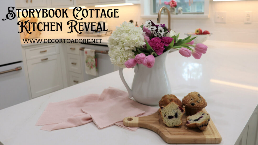
Hello sweet friends! Today is finally the day for the Storybook Cottage Kitchen Reveal. We began this long journey last June. To be honest the kitchen is still only about 90% finished. We are still waiting on a vent hood and there are a few small areas that need attention. But you’ve waited long enough!
Need to catch up?
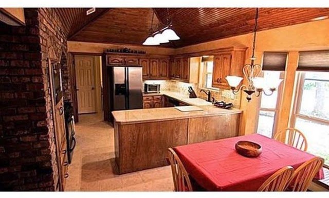
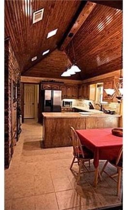
- Before photos were the focus of Week 1
- Demolition occurred in Week 2
- Cabinets and hardware were shared in Week 3
- A paint disaster happened in Week 4
- German Schmear was applied to the hearth in Week 5
- It was complete chaos in Week 6
- Lighting and countertops were covered in Week 7
- The backsplash and faucet were featured in Week 8
- The GE Café Appliances were featured in Week 9.
Storybook Cottage Kitchen Reveal
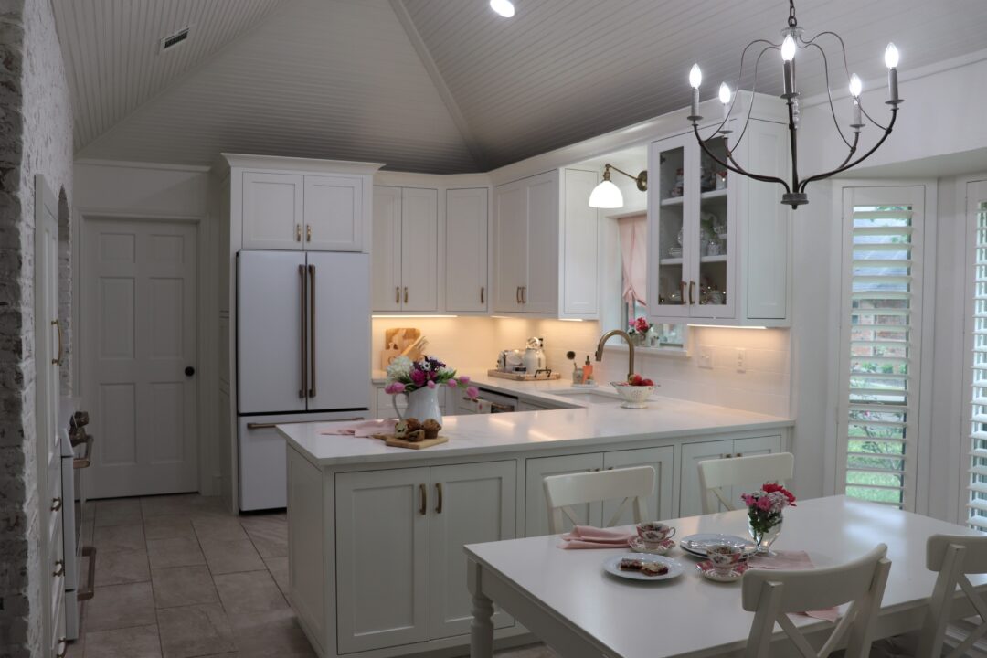
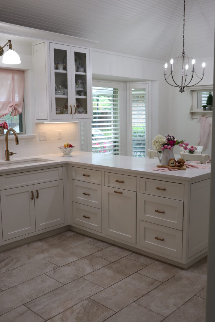
The layout of the kitchen did not change. We just made the footprint work a bit harder.
The upper cabinets now go all the way to the peaked ceiling and contain three shelves. Previously we only had two shelves in each cabinet.
The peninsula was shortened on the end to ensure that the kitchen fulfills the accessibility standards provided by ADA guidelines. It was also widened a bit on the dining area side to allow for cabinet doors on the backside. This eliminated the corner cabinet conundrum. We now have access on both sides.
A few weeks in and I am still in love with our Counter Depth French Door Refrigerator.
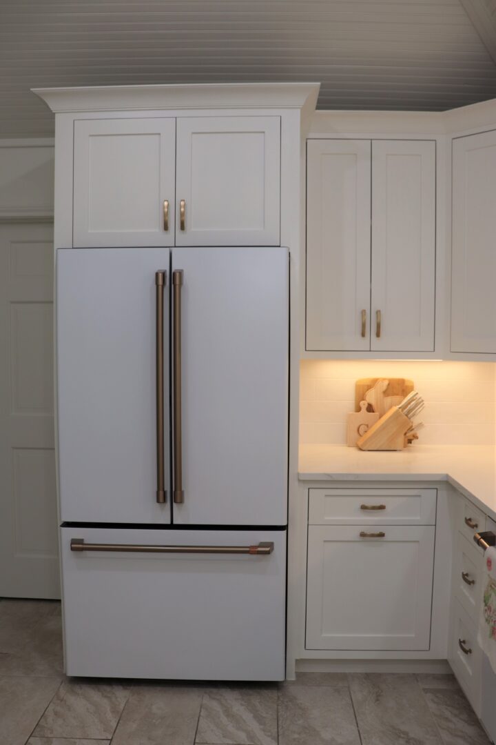
Ditto for the 24 in. Fingerprint Resistant dishwasher. All of the appliances were selected in a Matte White finish.
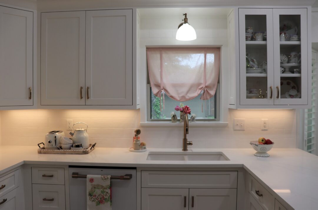
The new under cabinet direct mount lighting is such fun. It offers a wide range of whites and intensity.
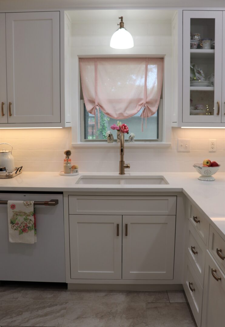
For the sink area the backsplash tile is Maiolica White Matte Ceramic Tile made by Canvas. It is a very budget-priced tile that we found at Floor & Decor.
We used MAPEI Keracolor Unsanded Grout in the color Avalanche.
For the caulking: MAPEI Keracaulk U Paintable Latex Caulk in Avalanche was selected.
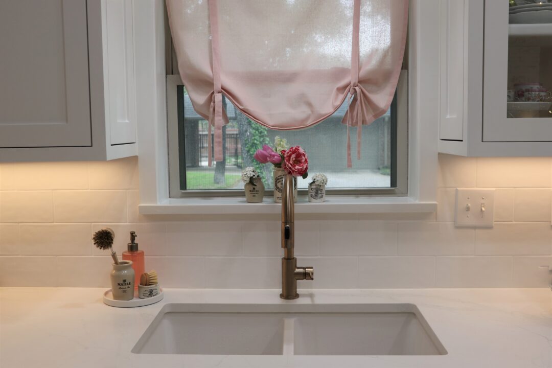
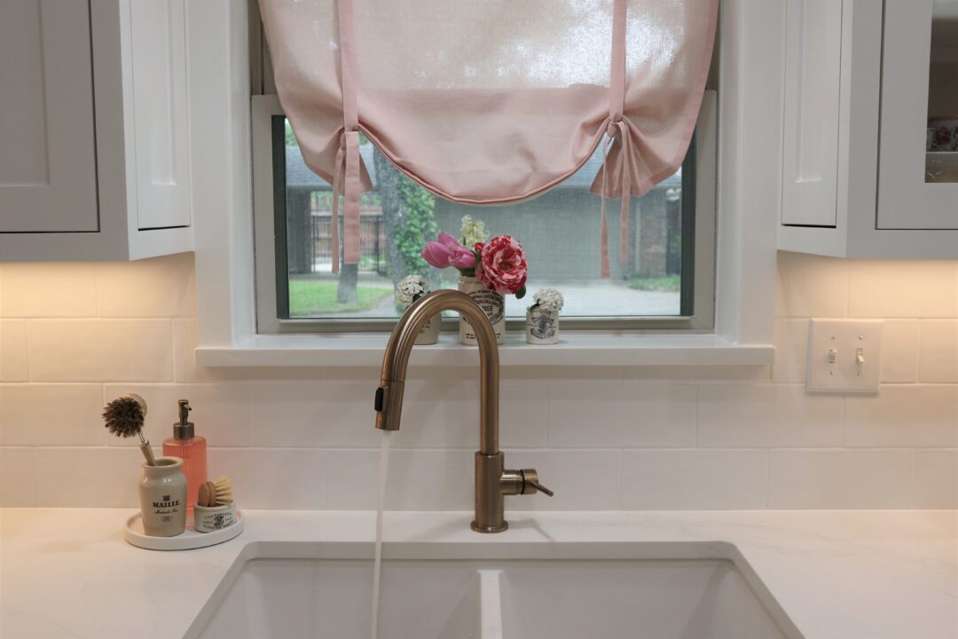
The faucet is the Delta Trinsic Faucet in Champagne Bronze. It features a single-handle, pull-down sprayer. Because our countertops are made of quartz we opted to also select a white quartz 33-inch double bowl undermount sink.
To keep a clean finish a white disposal flange and strainer were also selected.
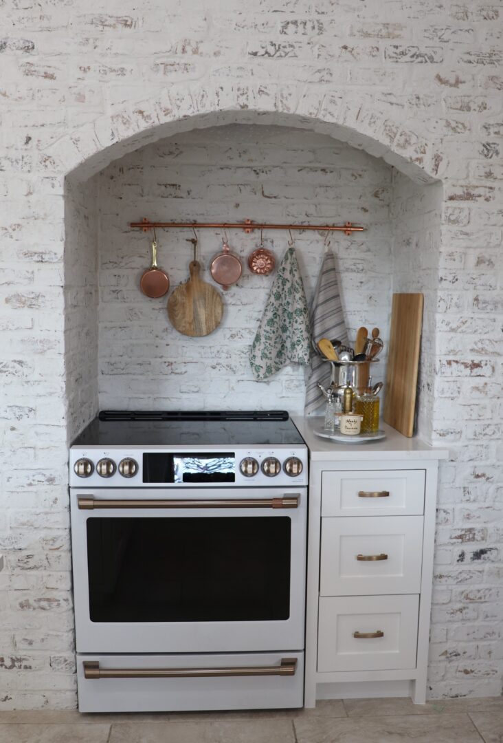
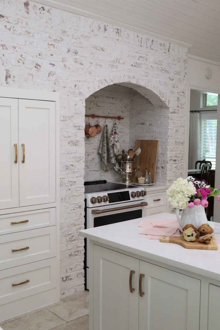
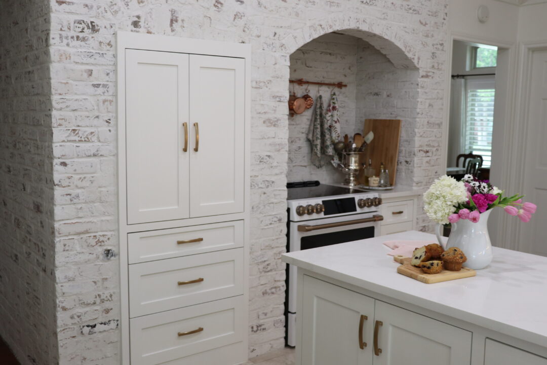
I think the biggest difference is the hearth area. The white German schmear treatment that now covers the dated orange brick is truly a transformation.
I am still in the learning stages of mastering the 30 Inch Slide-In Electric Smart Range with Warming Drawer.
My goal was to create a timeless kitchen with an old-world appeal. So we opted to install a top cabinet with pocket-like doors to enclose the microwave when it is not in use. It’s a small but meaningful touch.
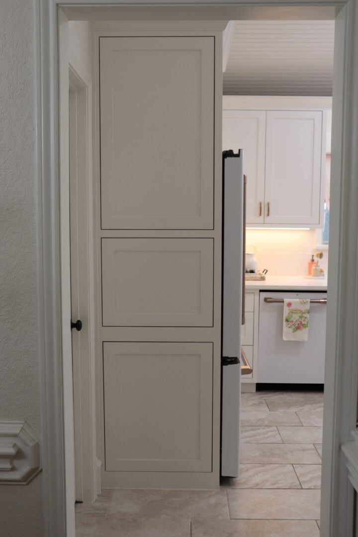
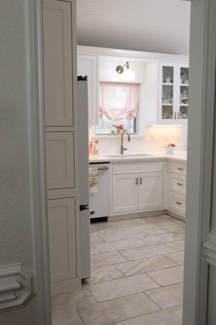
From the other entry point, located near the formal dining area, I wanted to enclose the side of the refrigerator. In the previous kitchen, it was a bit of an eyesore to look at the solid black metal side of the fridge.
I wanted just two side panels so that hanging artwork would make more sense. Alas, as with other areas, we had some issues with our cabinet maker. It’s a first-world problem and I’ve moved on.
You may notice that the refrigerator is not flush with the cabinet. This allows the doors to function. You can avoid this if you go the route of a built-in refrigerator. That was a very expensive option we decided not to take. We also wanted the option of taking the refrigerator with us in a few years.
We now have pull-out drawers instead of cabinets on the interior peninsula. I am still on the fence about the functionality.
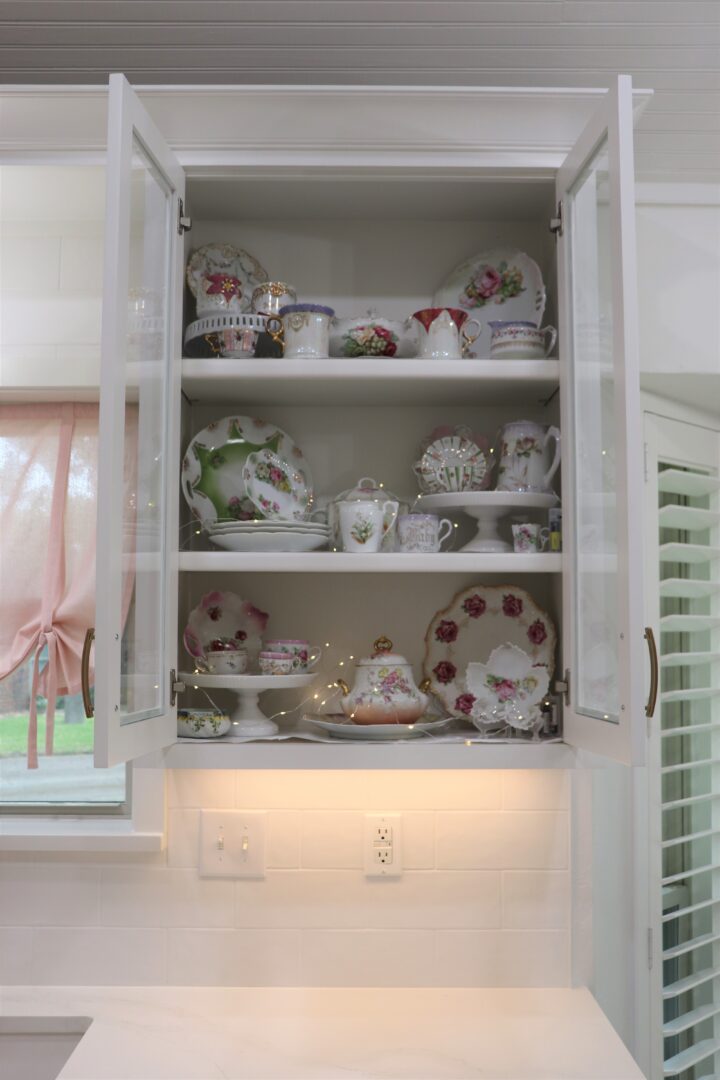
Right now the glass cabinet is filled with the antique Bavarian china collection. Mr. Decor does plan to install some additional interior lighting.
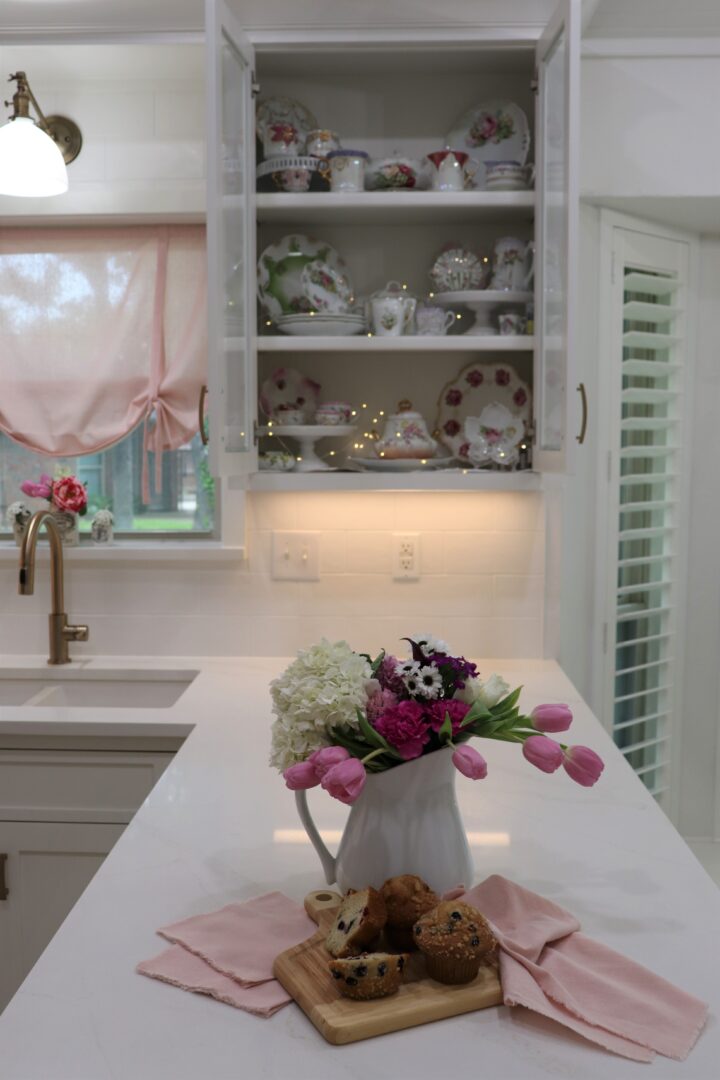
Until then fairy lights are fun.
Great Heights
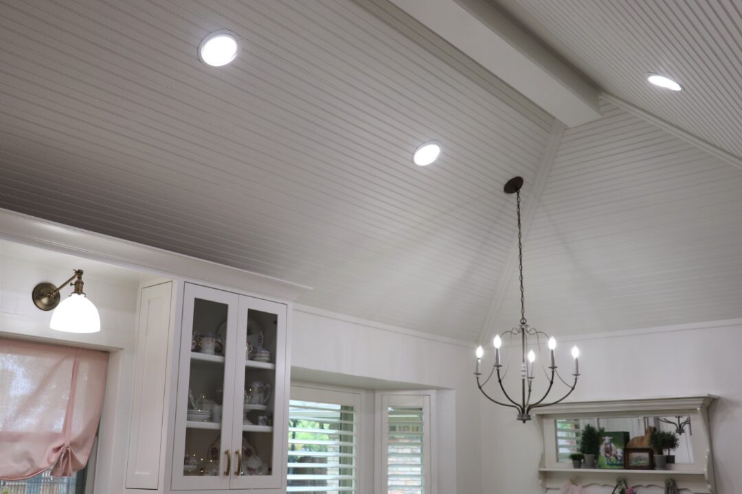
Many readers were never aware that we had such a high peaked ceiling until we installed new lighting to show it off.
The room is so much brighter with the Halo 6 inch can less recessed LED lights.
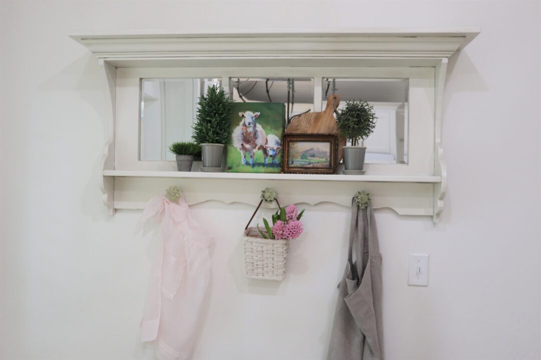
In the dining area, we hung a shelf that came out of a one hundred-year-old home.
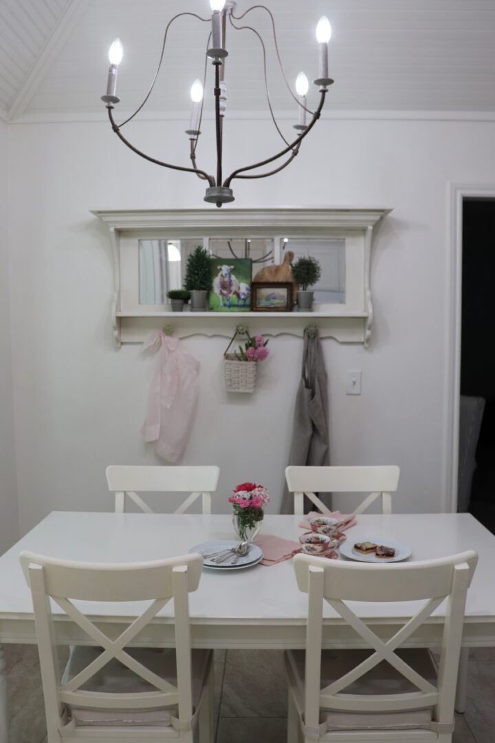
It is about time to give it a fun decor makeover for the summer. Look for that next week!
Tuesday Decor Video
You can get a true 360 look at the kitchen in today’s short video.
I hope you have enjoyed today’s post. If you have any questions not answered today or in any of the previous posts feel free to leave a comment below.
Disclosure: affiliate links have been used in this post. If you purchase something through the links, I may receive a small commission at no additional cost to you. Thank you for supporting Decor To Adore.
[show_shopthepost_widget id=”4764132″]
I’ll be back on Friday with another fun post.
Laura
It looks absolutely gorgeous, Laura! So bright and light! And while I’m rhyming, it will be a delight to be spending time there. Well done — that’s a long road and you’ve walked it graciously!
I love it! So much lighter and brighter. I especially like the idea of making the island accessible on both sides.
Such a beautiful kitchen! I love a light and bright kitchen and you have accomplished that. The island is great and love the chandelier. The chandelier and the recessed light give so much light to the kitchen.
This is perfect Laura! I love the details and how bright and cheerful it is. So different from the dark kitchen you started out with when you moved in.
I like the shutter blinds in your window and the brick work is simply amazing! I like the drawers you installed on your peninsula. You will never regret having those handy drawers instead of cabinets.
Enjoy your lovely, romantic, storybook kitchen! 🙂
White kitchens are my favorite. This one is just beautiful!
Laura, so happy for you that you now have the kitchen of your dreams. It is just lovely down to the last detail! Since we spend so much time in our kitchens, you will really enjoy working in this beautiful space. I am still lusting over that antique shelf – what a find!
It looks absolutely beautiful Laura! You all did a wonderful job with design and functionality. Ann
Your kitchen looks amazing and I know you love being in there! When we first moved into this last house, I questioned the functionality of the drawers vs. cabinets too but have fallen in love with them and honestly never want to deal with a cabinet again. Hope you do the same. And even though you want to some day have the option to take the refrigerator with you, I hope you never move. Unless it’s closer to me.
It is perfectly well done! So beautiful and peaceful. Thank you for sharing your journey with us, and for giving us a glimpse of more genteel times.
So pretty, nice and bright! I love the hearth area, and your appliances are gorgeous. I have deep drawers in my kitchen island and love them. And then I’m not quite 5′ tall, cabinets are not my friend.
Just beautiful!!
bright and light!
I adore a white kitchen!
I am a fan of drawers vs cabinets!
back in the early 80’s, purchased a builder’s home..
Beautiful..kitchen sold me..no bottom cabinets ..just drawers!
the entire house was a dream ..
back then, entertainment was part of my job..
the fit and flow of the kitchen made my job so much easier!
enjoy your new white,bright and beautiful kitchen dream come true!
WOW~WOW~WOW!!!! Pure perfection!!! The brickwork area is my VERY favorite. BUT so are the cabinets, the appliances, the counter tops and ALL!!!! You’ve just upped the price of your home greatly. Oh!!! That brickwork!!!! AND I love that you hid the microwave. I put mine in the garage (right off the kitchen) I don’t like the look of them AND rarely use it…. if ever do …..only to melt/soften butter.
After all this work….you want to take the refrigerator with you!!!???? Enjoy your new kitchen!!!
I am in love with your fridge and dishwasher!
My old boss says “90% of the work takes 10% of the time, and the last 10% of the work takes 90% of the time, so you should release at 90% done.” Computer programs or kitchens, it’s all the same!
So glad to see this beautiful transformation!
Oh, it’s so light and fresh looking ! It must certainly be a joy now to go in there & cook.
IT JUST COULDN’T BE MORE PERFECT! LOVE EVERY NOOK AND CRANNY!
It’s so bright and beautiful!!! What a wonderful transformation.
Love your kitchen reveal Laura…the brick is my favorite as well as the high ceiling. Great job and I know you will love the drawers. I actually put my dinnerware in my drawers…love it. so much better than a high cabinet. Hugs my friend.
Kari
It is absolutely beautiful, Laura! I bet your are just over the moon. Wonderful choices and I love the brick. xo Diana
So so gorgeous, Laura. Your cabinets are amazing with the gold handles. I love all your ideas! I’m sharing this post tonight on All About Home. Thanks so much for sharing it with us!
Oh, this is absolutely beautiful! My dream kitchen. I love the fresh, bright look and the wonderful treatment on the brick. I’ll be featuring it at the TFT party tomorrow. Thanks for sharing with us!
Beautiful kitchen Laura and your appliances look perfect in your sparking white kitchen. Love it!
Laura, I have followed this project with your interim updates. I am so happy for you! You and Eric must pat yourselves on the back for the great job you’ve done and managed others helping you do. It looks amazing. I love the German schmear hearth (both sides!), and your new appliances. Nice touch with hiding the microwave.
Gorgeous! A truly designer looking kitchen, Laura! I love love LOVE it!
Big TX hugs,
Stephanie