It’s hard to believe but somehow six months have come and gone and it is time once again for the spring edition of the One Room Challenge hosted by Linda at “Calling It Home”.
This time I will be working on finishing the entryway and living room at Storybook Cottage.
It truly is a bit of a challenge to try and complete a room design in just six short weeks. Particularly when you have just moved into a 30 year old that needs A LOT of work! But we’ve been so pleased with how our first challenge, the family room, turned out.
![[One%2520Room%2520Challenge-Decor%2520To%2520Adore%2520155-001%255B3%255D.jpg]](https://decortoadore.net/wp-content/uploads/2015/04/One252520Room252520Challenge-Decor252520To252520Adore252520155-00125255B325255D.jpg)
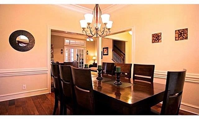
So let’s start off with a few “before” pictures of the living room space. This was how the previous owners decorated the room.
![[new%2520home%255B3%255D.jpg]](https://decortoadore.net/wp-content/uploads/2015/05/new252520home25255B325255D.jpg)
![[newhome1%255B3%255D.jpg]](https://decortoadore.net/wp-content/uploads/2015/05/newhome125255B325255D.jpg)
Since we moved in 6 months ago the space has remained virtually empty.
![[The%252010%2520Cent%2520Tour%2520036%255B4%255D.jpg]](https://decortoadore.net/wp-content/uploads/2015/08/The25252010252520Cent252520Tour25252003625255B425255D.jpg)
That’s not so great since it’s the first thing you see when you walk in the front door.
![[our%2520house%2520051%255B4%255D.jpg]](https://decortoadore.net/wp-content/uploads/2015/05/our252520house25252005125255B425255D.jpg)
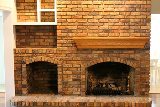
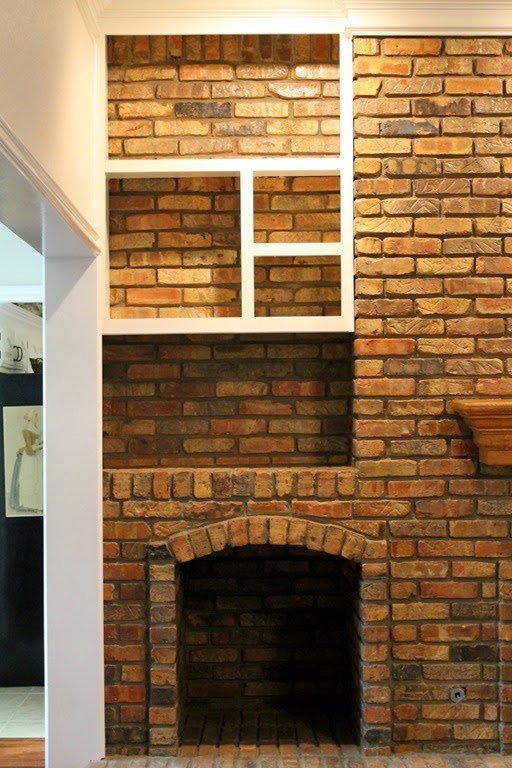
There is also the issue of the ginormous fireplace. It is so large that you can’t get its complete height all in one shot. Not to mention the oh so wrong mantle.
This huge, hulking, overbearing elephant takes up one complete wall in the room.
![[The%252010%2520Cent%2520Tour%2520038%255B4%255D.jpg]](https://decortoadore.net/wp-content/uploads/2015/04/The25252010252520Cent252520Tour25252003825255B425255D.jpg)
The current built ins join the long list of a string of previous owner DIY disasters. They are truly poorly executed with unsanded wood topped with globs of dripping paint followed by massive amounts of caulking to try and hide the imperfections. They need to be ripped out and so they shall.
The wood storage area underneath is no longer necessary as the previous owners turned it into a gas fireplace so that black hole also needs to be dealt with.
I do like the idea of a set or two of cabinets like what Joni, from Cote De Texas, did. But perhaps with glass insets.
Now longtime readers may recall that I shared an inspiration board for the space back in January.
I did paint the walls “Cottage White” by Behr and that helped to brighten up the room since there is very little natural light. The Ektorp couch, which is currently slipcovered in Tygelsjö beige, is still too dark for the space. I also sewed the Schumacher’s Chiang Mai Dragon in the Alabaster color way. They did nothing for the space. (So sad because I loved them.) The room needs a white slipcovered couch and brighter pillows.
Also, the red lantern for the entry turned out to big a big “NO!”
I ended up creating a verdigris finish on a HomeGoods candle holder and wiring it with lighting from Goodwill .
![[Storybook%2520Cottage%2520Entryway%2520021-001%255B3%255D.jpg]](https://decortoadore.net/wp-content/uploads/2015/04/Storybook252520Cottage252520Entryway252520021-00125255B325255D.jpg)
The hutch, yep, it still sits there, unpainted.
![[French%2520Hutch%2520005%255B3%255D.jpg]](https://decortoadore.net/wp-content/uploads/2015/04/French252520Hutch25252000525255B325255D.jpg)
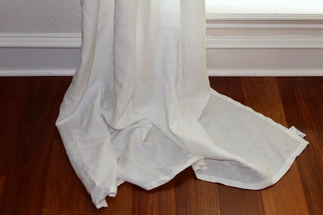
The simple linen panels that were hung are still not hemmed and remain uninspiring…six months later.
I need the One Room Challenge as a motivator to just get it done ALREADY!
Other challenges are a miniscule budget…about $3,000. When you are talking about custom cabinetry, rugs, artwork and 3-4 major pieces of furniture that are still needed for the space it will go quickly.
But I have a plan and hope to transform the space in just 6 short weeks. 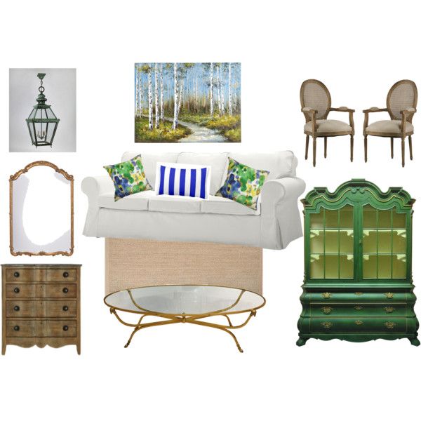
I will leave you with a question. What would you do to this fireplace/surround if your husband didn’t want you to paint it?
Laura
Next week: rugs, furniture selection and other disasters.
![[image42.png]](https://decortoadore.net/wp-content/uploads/2015/04/image42.png)
![[y%255B2%255D.jpg]](https://decortoadore.net/wp-content/uploads/2015/04/y25255B225255D.jpg)

There is absolutely no doubt in my mind that your room will be stunning when you finish. You have an excellent eye and amazing talent for redoing furniture and creating a beautiful room.
I am so impressed with the beautiful big spaces you have to work with. Everything is bigger in Texas, isn't it? lol
If the fireplace can't be painted…you could always try swinging a sledge hammer. lol
Can't wait to see the transformation and all the projects you share along the way! 🙂
Personally, I would build up that upper hole to put a large thick wood mantel across the whole fireplace in place of the skimpy one that's there. You wouldn't see the part where you built it up, because it would be covered with the mantel. The rest I would have straight wood shelves going across for books.
In that lower hole, even if it's not a wood burning fireplace, I would put wood in it for decoration. Maybe birch?
Anyway, whatever you decide, I know it'll be beautiful 🙂
xo,
rue
I'm not decorating expert, but besides changing the mantel and the shelves, if I couldn't paint it, I'd learn to like it. I've had built-in items in a house that I just hated, and even had my husband knock out for me, and later saw them in a magazine or blog– in a different setting, decorated in a different style– and I liked them!
Sometimes you can develop that “I really hated this when I first saw it, but now I am used to it and can't imagine the place without it” feeling.
You have done wonders with the rest of the house, I'm sure you will be able to make the fireplace look right paint or not!
-Lillibeth
I love the idea of removing the shelves and having doors made to fit the space and lined with shelves. I also like the idea of a much larger and more distinctive mantel. I think I would leave the wood box and fill it with pretty wood or a pretty plant, I like that look. Can't wait to see it all done.
So excited for your project Laura! I'm joining in too with Sophia's nursery!
This comment has been removed by the author.
With the great bones of the room and your talent for interior design, I know that the sitting room will look stunning once finished. xxx
I like your new inspiration board very much!
I do like the idea of a mantel all the way across. There are so many horizontals and verticals in the current config that don't line up. I might try to make that happen – giving you 4 separate spaces -right over mantel (art/mirror), right unde rmantel (fireplace), left overmantel (shelves w or w/o glass doors) left undermantel (either with wood in the space, or just put doors over it. and pretend it's just a cabinet…)
I had one of those once, except the homemade built ins were not there. It took up was too much space and the worst thing was stubbing my toe on the raised hearth. It's just the perfect height for that to happen. Pleasing Mr. Decor and yourself is a tightrope walk. I left mine and learned to live with it but had to put a piece of furniture by the hearth or I would have no toes left. Maybe yours isn't that bad. In my perfect world I would knock down all the brick to the left of the fireplace, remove the mantle and panel over the fireplace, possibly leaving some brick exposed around the opening. Then build a cabinet to the left that looks like part of the paneling with glass doors on top. Working with that existing structure will be hard. But like I said that is in my perfect world. If I was going to stay long Term I would seriously consider it. You could even Sheetrock over it and add moldings and paint it semigloss and it would look like wood paneling, add a proper sized mantel with deminsions and possibly carving and you would have a very traditional, usable wall.
Good luck with finishing the room! It will be awesome as you have some great things to work with…including that gianormous fireplace!! It will look awesome when you have put your touch to the room!
What Rue said for your fireplace – I'd paint all the wood white – the same shade as your woodwork. You could also opt to put doors over the gaping hole and then it would become hidden storage for games etc. If you used a white frame on your artwork and make the artwork large, that too would help lighten up the space. An impressive mantle and artwork will go a long way toward drawing attention away from all the brick. Whatever you decide to do will be beautiful.
Ok, what I think is go with it. I would still put wood in the wood spot…..and work around it. I think it is actually pretty and my hubs wouldn't let me paint it either. I am sure, absolutely sure, the room is going to be gorgeous!
No disrespect to Mr Décor but I would paint that fireplace anyway. After all, who is the decorator in that family and what is her track record? Pretty good I would say! Good luck! I can't wait to see what you come up with. I am doing our foyer too if I can make some decisions!
What a beautiful space to start with! LOVE the pops of colour your planning!!!
I'm new to the group but I had to add my worthless 2 cents haha. I actually like the natural brick. Believe me I don't hesitate to paint things but this reminds me of interesting brick wall like you see in old row homes and lofts. I think it's the mantel and shelves that take away from it and tries to mix styles that don't work well together. A few of my favorite restaurants have walls similar to this and they went in a very warm chic direction. Instead of fighting it I'd look at it for what it is a search out inspiration how to play it up. I think it could be fabulous.
I'm excited to see what you do with this space. I think it's great that so many of us are suddenly ready to tackle those things we've put on hold for so long… thank you ORC! Good luck!
Wow! These pops of color will make the space fun and inviting. Cant wait to see the end product.
Ha! I would email you! 🙂
~Liz