Welcome to part two in the “makeover your office inexpensively” series. Today we are going to talk about color. Color is very personal and subjective. There is no “wrong color”. Only what appeals to you personally. So look Somewhere Over The Rainbow Finding Your Perfect Color.
Somewhere Over The Rainbow Finding Your Perfect Color
As an interior designer, I often have to be part marriage counselor in helping couples select colors for their home that they both can live with. In my own home, you might be surprised to learn that I am of the “White is alright!” camp while Mr. Décor is firmly entrenched in the “Bold is better!” category.
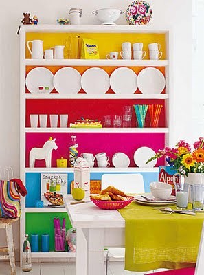
The most simple but important design tip that I could ever give to you is this: in your own home don’t surround yourself with a color (on walls, accessories, etc.) that you wouldn’t wear. Are you scratching your head?
I have received many calls from people who were very unhappy with their homes and they didn’t know why. Like the auburn-haired beauty who had made a cocoon of tomato red and couldn’t figure out why she had begun hating her home. Right when I walked in the door I knew. I asked one simple question. “Do you have this color anywhere in your wardrobe?” “Her reply was “Oh goodness no! I would never wear red, I look horrible……” She didn’t even finish what she was saying. The light bulb had been lit.

Stay True To Yourself
It is human nature to be drawn to certain colors. We like what we like. Sometimes we get off track when someone tells us “sky blue is no longer fashionable”. Stay true to yourself.
Now neither Mr. Décor or myself is partial to mustard. Which happens to be the color of the settee I brought home. So what to do when faced with this dilemma? Pair it with colors that you do like that work well with the less desirable color.
Pairing Colors
Although there are no wrong colors, there are very definitely wrong pairings of color. Again this is a tricky concept for some. From the time I was tiny, I would emphatically state “those colors don’t go”. Once I had completed a semester-long class on color theory I then understood why my inner voice said so. For those lacking the voice, it’s ok. Today one only has to google “What color looks good with chartreuse” (or insert any other color) to find answers. But there are also several books on successfully pairing color and her sister, pattern.
For those who are afraid of color, there are ways to introduce it slowly that won’t overwhelm. I myself love an all neutral background with just hints of color found in the accessories.

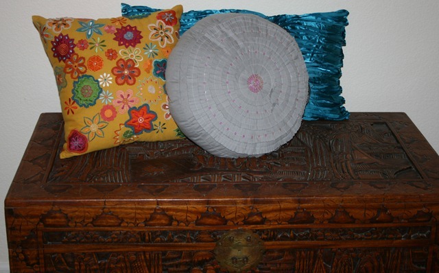
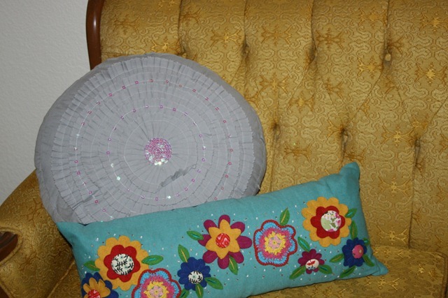
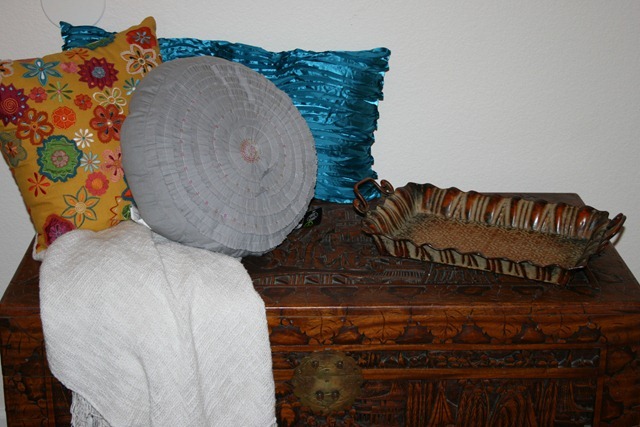
So here is what is happening in the office. I knew I wanted to soften the chest with a few pillows. Both Mr. Décor and I love and wear teal well. The long lumbar shape mimicked the shape of the trunk. In design, repetition is always a good thing. In a twist, the shiny satin is a textural contrast to the carved wood.
The square pillow marries the mustard of the settee with the teal and other chosen color. But I’ll give you a hint. It’s not gonna be gray.
Create Your Own
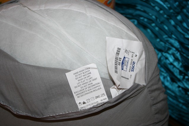
I had been looking for a round shaped magenta pillow. Could I find one in my price point? Of course not. I did find this gray pillow at Ross for an acceptable price. (Unless it is an antique, I never pay more than $10 for a pillow.) The first thing I checked was if it had a zipper cover. Check! Then I searched for the fabric content~ 100 % cotton. Perfect! A superb candidate for a dip in a magenta dye bath. Because if it fails, I am only out $5.99. This is a very important point to consider. Don’t dye anything (IE a family heirloom) if you would be devastated if it didn’t turn out.
I had purchased a second pillow that will go on the settee. One pillow at a time was dyed to make sure it turned out ok before I dipped another $5.99 into a pot of boiling dye. (I mixed equal amounts of Rit dye fuchsia and violet to achieve my desired shade of magenta.) You’ll see the results in an upcoming blog post.
Dye It
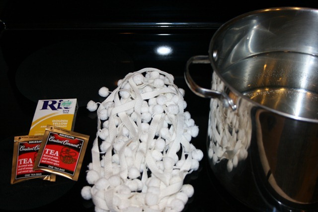
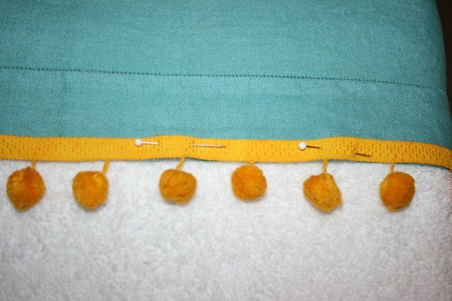
In addition to the pillows, I wanted to dye a vintage linen tablecloth a pretty shade of teal. There was also white vintage pompom trim that needed to be golden yellow so that I could create a very low-cost window mistreatment of sorts.
Regarding the dye, I prefer liquid dye. It is much easier to control the intensity of the color you want. Particularly if you are dyeing a small amount and don’t necessarily need to use an entire washing machine. For the white pom-pom trim, I had to settle for the powdered dye as I could not find the shade I needed in liquid form. (I sprinkled in 1/2 of the box sealing the rest in a zip lock bag for future use.)
Tip: If you do have to use powder dye I recommend using the hottest water you can so that it will dissolve completely. If you don’t, the color could streak or spot.
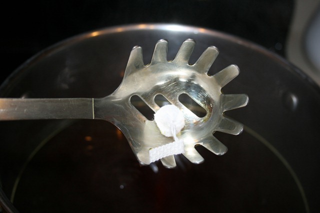
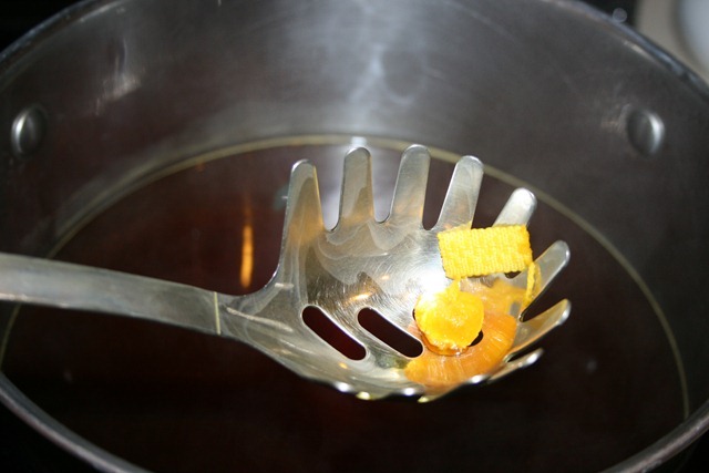
When using the stove top method make sure you use a stainless steel pot and utensil. Otherwise, you might dye something you wish you hadn’t. After you have checked that the dye has dissolved completely add a small piece into the bath to check it is the color you want.
After a first dip, I knew that the color needed to be a bit “muddier” so I added a tea bag. This is me just winging it. For those who need a more precise way of doing things, Rit does have a complete color formula guide on their website to help you achieve the color you want.
It’s Curtains
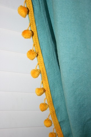
Perfect poms! They were pinned onto the now teal tablecloth and given a zig zag stitch.
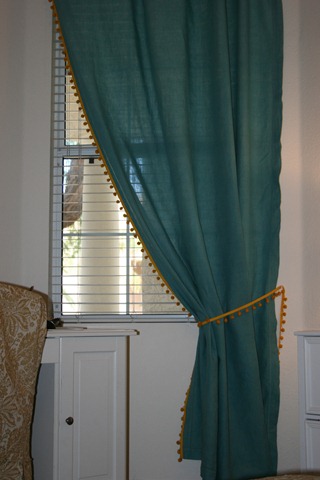
It’s looking less like a tablecloth and more like a drape.
I plan on adding a wide ribbon trim next to the poms and sewing a fabric tieback. But it’s looking pretty good for a $4.00 curtain.
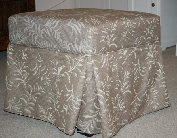
So how am I inexpensively transforming this eye sore? First and foremost the excess fabric will be torn off removed. Then a slipcover has to be made.
Slipcovers
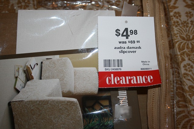
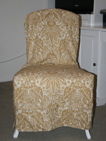
While in Pier 1 I spotted a chair slipcover that was originally $69.95 and marked down to an incredible $4.98. The fabric was good quality. It was also 100% cotton and therefore eligible for a dye bath dip. The damask print was an excellent paring to the French inspired settee.
On a side note, I also receive a 20% designer discount on new and clearance items so that brought it down to a mere $3.98. I bought two.
Something to consider: Often the discounts a designer receives (and hopefully passes onto their client) can result in a savings substantial enough that it “pays” for their services.
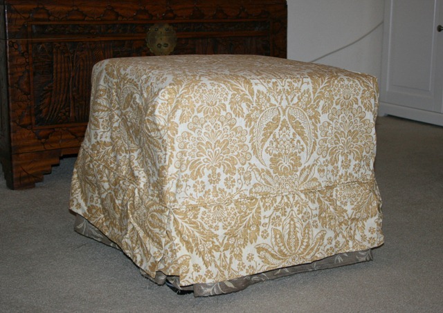
I will have to remove the upper portion of the chair cover (I’ll create a pillow from the leftover fabric.) and tweak the rest of it to fit. But I think it is a fantastic low cost option for the ottoman. The total price? Ottoman $8, slipcover $3.98 plus $2.00 if I decide to dye the fabric. I’m waiting to see what color is needed in the room.
So what am I doing with the second seat cover? Covering a seat of course! It too needs a bit of pinning and sewing, but hopefully, it will turn out beautifully.
I need a few days to work on some labor intensive projects but hopefully, I’ll have some great examples when I talk about inexpensive accessorizing and the power of spray paint very soon.
What is your favorite color?
Laura
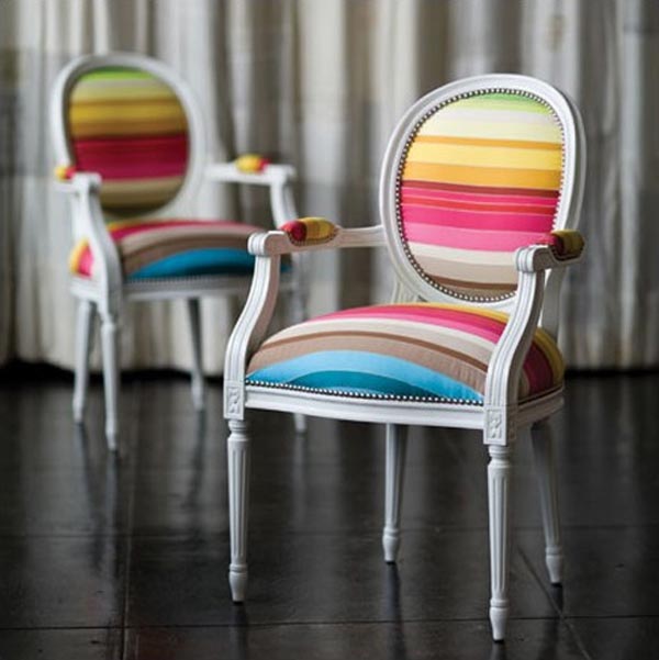

Green! Then go across the color wheel, and back again. Then cross it and back again. THAT's my favorite color.
That's what I said. Green.
*wink*
They turned out great! Loving the pompoms on the curtains!!! And I loveeeeeeeeeee pink… but rarely wear it and except Brookie's room – never decorate with it… but it is my fave color! LOL! :):):):):):):):):):):)
I'm loving the colors you are bringing in here, Laura! I can't wait to see the next step. Love the color of the drapes!
You always amaze me with your dying ventures. I know everything will turn out beautifully. I have also found (powder) dye at JoAnns that is made specifically for polyester, I purchased some, but haven't tried it yet. It may open new vistas for you ;).
Go Laura..I can't wait to see the results of everything! And thanks for the dyeing tutorial. I've been “dyeing” to find out how you pull that off!
Love the colored books! Hope you don't mind if I pinned this on Pinterest (if you mind…I'll remove).
http://pinterest.com/pin/259097784781767341/
I love all shades of green! That is always going to be my go to color! Thanks for the inspiring pics!
I always seem to drift toward sage. I'm a mover changer…the color is very transitional. I can put any color with it!
Thanks for stopping by, Laura.
Just to let you know, I love your Metis site. It's a dream visit for me!
Also, I popped you an email about the skirt!
~Lynne
[w/L]
I'm loving the step by step guide through your transformation. Color can be a scary thing. I learned my color wheel back in the late 70's. In the 90's I started quilting and really stretched my color combining. I am much bolder now. So why do I have 4 navy sweaters, 2 black and no other colors in my closet? I'd rather spend money on decorating than clothes, I guess.
Wow!! Those bold colors are fun.
I am more a fan of muted colors..burgundy, dark blue, black and brick red.
I am a huge fan of grays, silvers, and blues with gray undertones. I want a black and white living room, but it has been vetoed by the man of the house. I would use colorful accents, but still no go. =(. My girls would love the bright color combos that you shared. Their wardrobes are full of it!
Looking good:) Ottomans are the easiest thing to slipcover – you should have no problem:)
I love white and all the shades of white you can go with to pump it up! and then throw a few pops of something bright in! I can't wait till I can pull out the Christmas decor.
I love all shades of
blue and am currently
in the throes of a “bringing
blue back” campaign at
my house, as we seem to
be living amongst sage,
red and yellow. My husband
also prefers blue, so there
you have it : ) Fun post!
xx Suzanne
I'm with you, love white. My last home was full of color but we wanted a different feeling here. My wardrobe is also very lacking in color so I guess I was spot on there. I think, because I am kind of hyper, I feel most comfortable in a place with less color – calms me.
You've got me wanting to dye something!
Purple…which I adore wearing, and in jewelry, but as I look around my home, the only purple I see are some artificial flowers!
You are really inspiring, Laura–it has been so long since I redid anything in our home; I think it is time.
Well, am I glad I stopped by and checked out your post today. I had visions of you dressed in an outfit with big shoulder pads (think Dynasty) when you said teal. But I LOVE the colour you used. It what I call 'turquoise' and has always been a eye-catcher for me. I love it with whites, or greys, yellows, pinks, black…it's almost a neutral! I had a turquoise scarf as a teenager and wanted my room done in that shade. Mom said 'No' but I still used it for a table cloth on a little table in my room and kept my 'treasures' on it.
Good luck with finding your paint can in the right colour! 🙂
Orange. It's a color I love in all it's permutations – from melon to pumpkin to copper. I've never dyed anything before, but really have to give it a try. I have a couple of things that I bought just because they were so cheap, but then never used because they weren't my colors. Great tips! Thanks for sharing.
Oh Laura, it's starting to get colour and shape of a trully fashionable home office.
I'm for white ambience with dark furniture and here and there details in bold colours (the operator word being d-e-t-a-i-l-s) – I think I'm a colour coward ;).
My daughter has a bold bedroom – you think of bold colours and be certain they're in her bedroom. But like you start your post with; she dresses the same way. BINGO LAURA! You're good in this!!!!
I'm in love with the teal with mustard accents' curtain. When do you think I should start packing to move there… it will be so you and lovely.
(now I'm off to search for the rosette post. I need to speed up my Christmas Crafts and tried to explain the rosette to dear hubby without success so I want to show him (setaed beside me in the sofa asking what's that long post you're writing to the poor Lady ahahahahahah) Men :rollingeyes:
This comment has been removed by a blog administrator.
Laura,
It looks like you are making great progress! I love the pops of color. I admire your bold choices and what a great idea of using the chair covers for their fabric. Can't wait to see the finished product.
Pretty pops of color!! Love the drapes especially!
Shades of turquoise blues/greens! Love the trunk!
xo Cathy
Can't wait!
These turned out terrific! I love all the pretty shades of color you used! Those pom poms are sweet! 🙂