I have always loved looking at Before and After Pictures. I imagine this is because it provides inspiration and ideas of what can be done. The photos below are from a project I have been working on for over a year. As with any renovation, there has been surprises and challenges.
Before and After Pictures
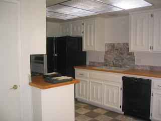
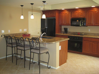
1. Kitchen~In the before picture of the kitchen, you will notice that the design called for an entire bank of cabinets to be removed. This really opened up space. Other cabinets were added near the attached atrium so the homeowner did not lose any storage space. While the layout of the kitchen remained basically the same to help control cost, it now is a very warm and inviting space.
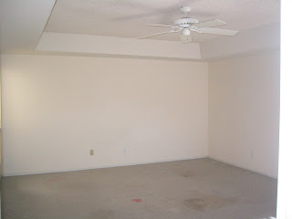
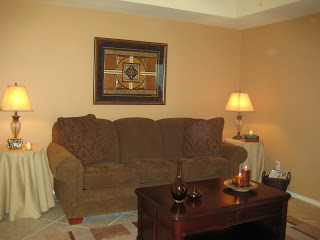
2. Family room~ This area is attached to the kitchen. The coffee table top is actually hinged and can be raised to eating level.
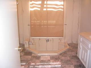
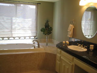
3. Master bath~ Yeah baby! The in-ground bathtub really said 70’s. It was an injury waiting to happen for the retired owner. The request was for a spa atmosphere. I feel relaxed, do you?
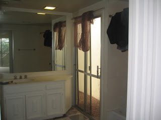
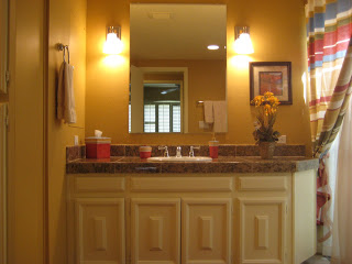
4. Guest bath~ It never ceases to amaze me what a fresh coat of paint, a new countertop, faucet, a smaller mirror, and lighting can do for a room. The bathtub was also reglazed and looks brand new.
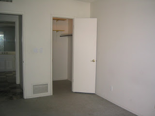
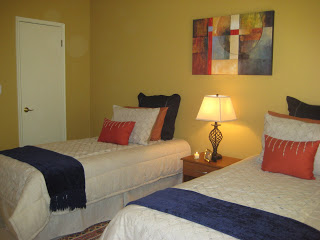
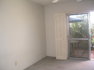
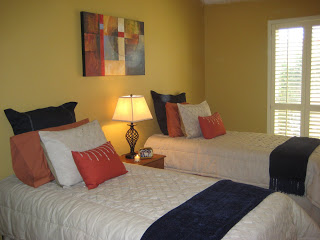
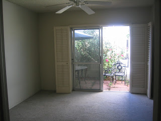
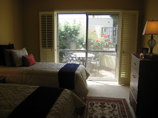
5. Guest bedroom A, B & C~ This room had a budget of $1000.00. That included having to purchase the mattresses and furniture. I love places such as Target, Marshalls, and Ikea don’t you?
Thank you for taking the time to view my photos.
Laura
Hi Laura,I like the guest bedroom before and after pictures best. The color selection is nice. It is calming to see a room without clutter.I did like your comments about the bathroom–is reglazing the tub easy to do? We purchased new faucents for our sink and could use an upgrade as you decribed for one of our bathrooms.
I vote for the bedroom. I love the wall color and how it makes the trim and the blinds “pop”. I also love the other colors in the room, from the art to the bedding. This room looks like a very soothing place to relax and sleep.Are you sure that the only change to the bathtub was the reglazing? I like that room as well but I just couldn’t get my head around the fact that it looks like a lot more than just reglazing was done to the bathtub area. You do beautiful work, Laura.
Hi Laura,Well, I have to say that the master bath is my favorite. You know me and tubs. That is my kind of tub. But, the rest also looks really good as well. Nice and relaxing.
I love the kitchen. I can only imagine how “closed in” one would feel with the bank of cabinets installed. I like the warmth of the colors and the openness. Great light fixtures!
I LOVE the kitchen. I especially like all the changes with the lighting. Where’s my basket?
Great Job! Your small budget had big band in the bedroom. The kitchen and bathroom were also great.
You do amazing decorating. I really enjoy your blog. I’ve been stuck in it for two days now 🙂