Welcome to the Décor To Adore summer series of design secrets. I’ll be sharing with you various solutions on how to decorate your home and create design solutions to common problems while on a budget.
In my best Julie Andrews voice I sing
“Let’s start at the very beginning
A very good place to start”
Now this first tip is both simple but difficult:

Each and every house will speak to you. It will tell you exactly who it wants to be. I am not the first designer to advise that it is a good idea to spend a bit of time in a house before you start knocking down walls and making other major changes. By spending time in the house you will learn exactly how you live in it. You can then make wise, informed decisions on how to alter it to best suit your needs.
A vast majority of people, (myself included) want everything done NOW. This often ends with disastrous results.

While your home may not result in the horror which was Tom Hanks house in “The Money Pit” you may end up trying to force a Craftsman Bungalow into a French Country House or think you can transform a Southwestern adobe into an English manor house. Stop! It won’t work. You’ll just end up with a confused house.

Once the offer had been accepted on our new home I made a necessary call to a housing inspector. He said he would need about three hours in the home. I asked if he would mind if I was also at the house. I would stay out of his way, I just wanted to get a feel for the home. He agreed and we both arrived in the mid morning with different purposes.
I sat down on the ground and stared at the four blank walls of each room for several minutes in complete silence.
Right away I felt that the existing paint colors made the rooms feel very dark and somber. Unhappy even.
The house begged for light, happy paint colors.
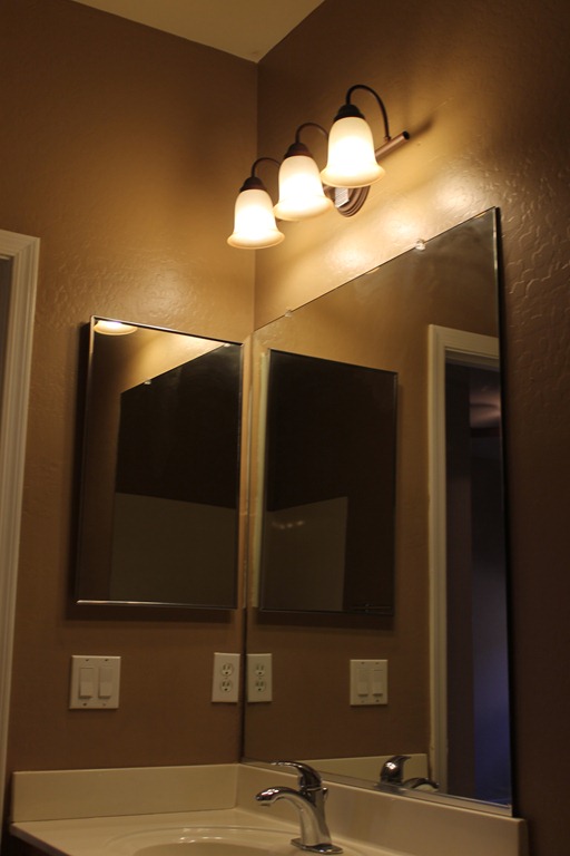
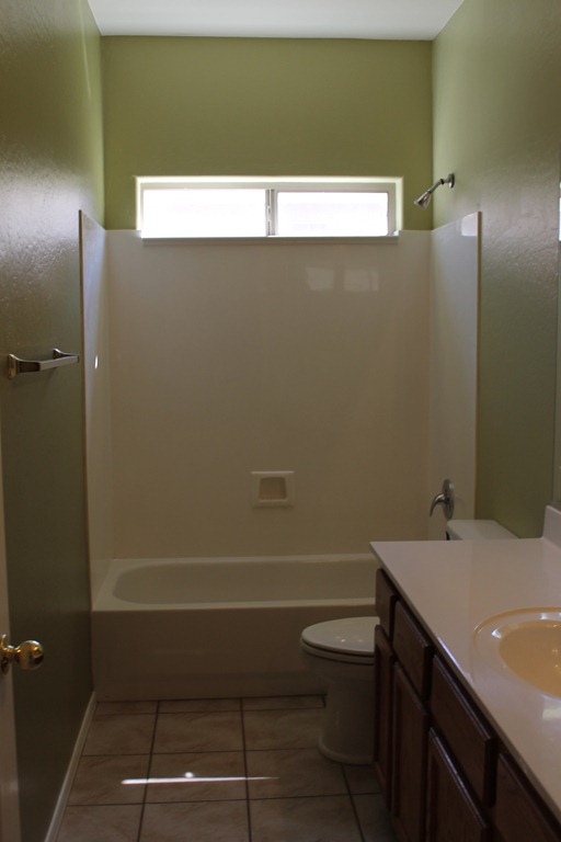
I don’t think the shade found in this bathroom would flatter anyone when preparing to greet the day. Sweet Boy referred to the color as “poop brown” ~ not exactly the look you want in a bathroom. 🙂
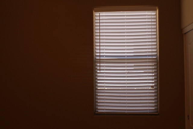
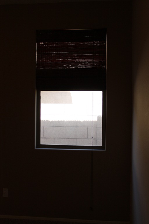
The vast majority of window coverings also did nothing to help the situation. I made note that when I actually pulled open the beloved bamboo blinds the view was not very appealing. But when I lowered the blinds the rooms were almost as dark as night even though it was mid day.
There were interesting window treatment selections found in other rooms.
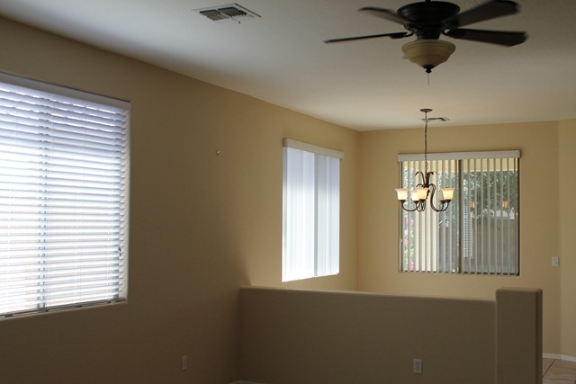
While I had a “What were they thinking?” moment in the following room I knew their train of thought. I have encountered it before on many occasions.
Even though there is a pony wall (SLEDGEHAMMER!) in this space it should have a unified look versus using a variety of window treatments. I have heard people try to justify the choices with “Well, it makes it feel like a true second room.”
Bare with me that a bit of design snootiness comes out ~ having graduated with a 3.9 GPA in design school please believe me when I say “No, it doesn’t.” The design reasoning is that it actually stops the eye and shrinks a space. It boils down to how our brain processes information and it reads such décor much like the old Sesame Street song …sing with me… “one of these things is not like the other, one of these things just isn’t the same…”
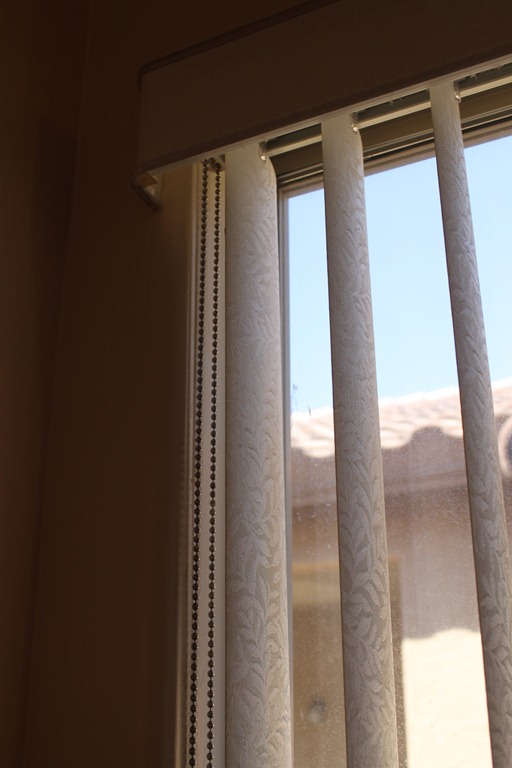
To compound matters some of the vertical blinds were covered in a “fabric” that locked in dust and grime.
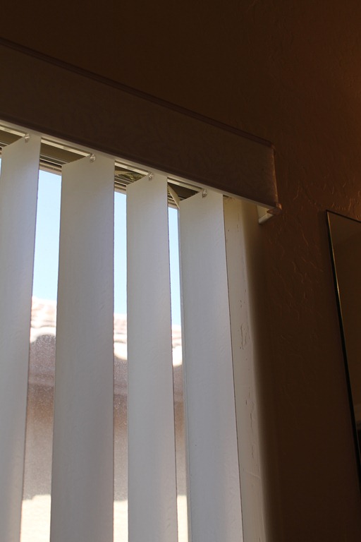
It must have been cheaper to replace broken/dirty slats with plain plastic as that had also been done. This is a design no no. Continuity is key.
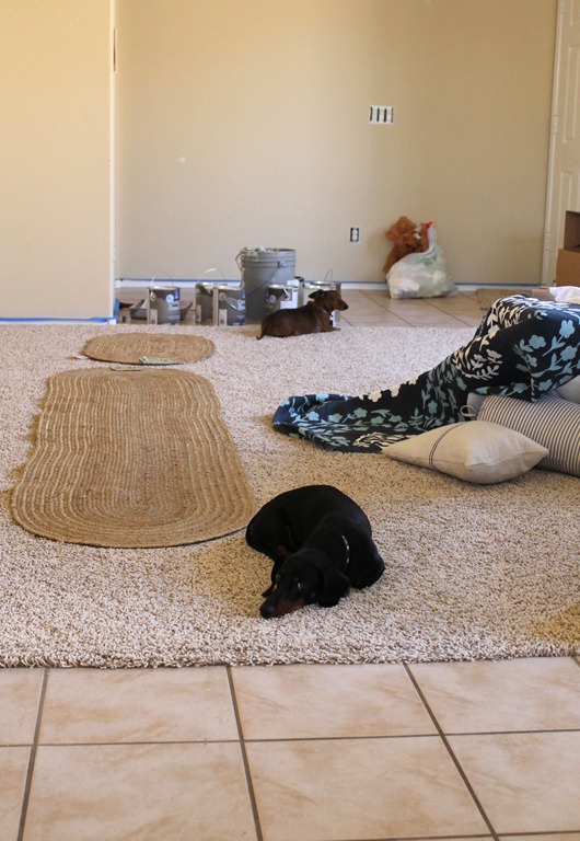
I also learned something very quickly from my design assistants that had accompanied me.
This is Franz. He should have been named Liberace because he is a pianist. Meaning the dog has to pee constantly.
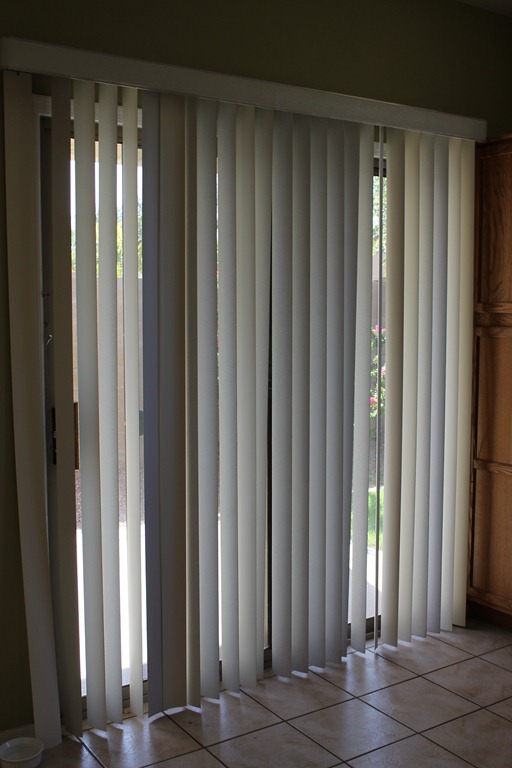
Every time I opened the sliding glass (arcadia) door to let him out the vertical blinds slapped around like a vicious car wash cycle. Both the dog and I were terrified. I went home and announced to Mr. Décor that I had “Yanked down those darn car wash blinds!” Mr. Décor is a smart man and he supported that decision.
Ok, so right off the bat by spending just a short amount of time in our new house I learned that fresh paint and other window coverings would be needed.
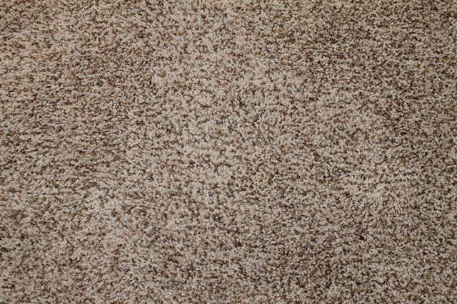
Of course the next question is what color? I cracked open my handy dandy designer paint sample box and began pulling small 3” x 3” sample squares out. One thing I knew that would not be changing was the existing carpet. While it would not have been my first choice, it is brand new and my budget is small. So stay it will.
There are also several areas of sand colored tile. It can be seen here in the “booger green” (again Sweet Boy’s description) bathroom.
Next up for the house~ paint,
Laura
I have temporarily turned off the comments while I am in the midst of painting. I hope you understand. You can always leave a message on the DTA Facebook page.

